


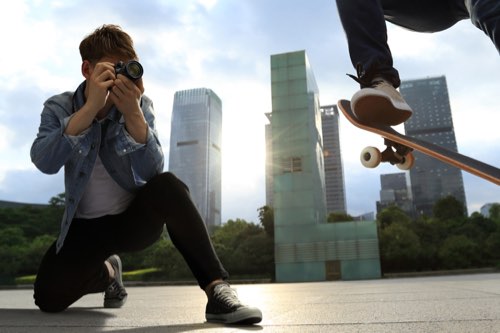


The reason for manually adjusting and changing colours pre-determined by the camera is to make it easier to convey the scenery seen and impression felt at the time the photo was taken. Exposure compensation plays a large role in this. It is important to consider the right level of brightness to match the scene as an overexposed or underexposed picture may look better. (Reported by: Maiko Fukui)

Pages: 1 2
Producing a Refreshing Blue
Normally, our brains compensate for the scenery that we see with our own impressions by overlapping it with the image we have in our minds. The photo shows Paris in winter. Due to the cloudy weather, the photo may easily become too plain. However, the scenery that I saw and felt then was that of a refreshing Parisian morning. The red colour of a sign, a coat, and a knitted cap worn by a child suddenly leapt into my field of view. In order to create a bright impression, I set the Exposure Compensation to +2EV. In addition, by setting the White Balance to [Tungsten Light], a refreshing and slightly blue overall impression was captured. If the camera model allows the white balance to be manually adjusted, set it to approximately 3,000K. In addition, set the Picture Style to Faithful and the Saturation in Detail Settings [+2] to make the red stand out. Compared to a photo without exposure compensation, the impression imparted by this photo is very different.

Before adjustment
EOS M/ EF-M18-55mm f/3.5-5.6 IS STM/ FL: 24mm/ Aperture priority AE (1/1,250 sec., f/4.5)/ ISO 400 / WB: Auto
Cloudy sky in a gloomy winter. I tried to express the scene of a street corner enveloped in the cold air in a refreshing and pleasing way.

After adjustment
Adjust the brightness and colours with the Exposure Compensation and White Balance. The heaviness of the clouds disappears, creating a seemingly cold but refreshing Parisian morning close to what I felt at the time.

Select [Tungsten Light] from the presets for White Balance.

The Picture Style is set to [Faithful] while the Saturation is set to [+2].

If exposure compensation had not been carried out. The impression becomes rather dark and the photo does not feel refreshing.
Depicting a Silhouette in Blue
In order to express the overlapping silhouettes like a cutout picture, the Exposure Compensation was set to -0.7EV to enhance the silhouettes. As the skies were cloudy and grey, the white balance was adjusted to emphasise the impression of a cutout picture. In the case of a silhouette, it is difficult to impart an unpleasant impression even with a strong colour. Set the White Balance to the lowest colour temperature if it can be adjusted manually.

Before adjustment
EOS M / EF-M18-55mm f/3.5-5.6 IS STM / FL: 39mm / Aperture priority AE (1/60 sec., f/6.3) / ISO 800 /WB: Auto
Capturing the beauty of the overlapping silhouettes of the tree and the Eiffel Tower as in a cutout picture.

After adjustment
With a negative exposure compensation, the enhanced silhouettes of the branches and the tower make them feel as if they are one. The deep blue reinforced the romantic impression.

White balance was set to [Tungsten Light]. Blue (B) was set to [5] in the Detail Settings.
Capturing the Impression of a Casual Alley in Green
Set the Green (G) to the highest level [9] in the Detail Settings for the White Balance so as to capture the impression of an ordinary alley. Set the Exposure Compensation to +1EV to produce a more refreshing green. Set the Contrast to [-3] to create a soft mood. Increase the Saturation to [+2] to emphasise the colours of the signboard in front as well.

Before adjustment
EOS M / EF-M18- 55mm f/3.5-5.6 IS STM / FL: 55mm/ Aperture priority AE (1/60 sec., f/5.6)/ ISO 400 / WB: Auto
I was surprised by the sudden sight of many plants as I entered a back alley in Paris. That’s why I tried to reproduce the vivid green that I saw then.

After adjustment
I managed to capture the mood and calm air of the alley brimming with greenery. It is a mood that is soothing to the eyes.

G was set to [9] while the White Balance remained at AUTO.

Born in 1983 in Osaka. Photographer. Actively involved in magazine and advertising photography, book writing, photography workshops and so on.