


Introduction to Fine Art Printing – Part 3: Colour Profiles and Rendering Intents
In Part 2 of this series, we discussed about colour spaces such as sRGB, Adobe RGB etc, and the importance of choosing the correct colour space for fine art printing. In this article, we turn our attention to the topic of colour profiles and rendering intents.

So what exactly is a colour profile?
A colour profile is a mathematical table assigning colours for your devices. All cameras, displays and printers have their own unique colour profiles – and they do not always match. This colour difference is called gamut mismatch and it occurs due to the different colour models and technology used in colour capture and reproduction.
Hence, the image leaving your camera has an embedded colour profile (e.g. Adobe RGB or sRGB) that helps your computer put up the closest possible colour image it can display or print. This embedded colour profile is needed for proper colour correction and colour management to operate.
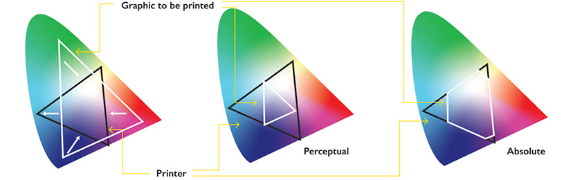
To manage the gamut mismatch, Adobe Photoshop and Adobe Lightroom’s colour management system compares the colour profiles of the image, screen and printer, and lets you control how to best manage the results via the Rendering Intent option in the print dialogue box when an image is sent for printing.

The four Rendering Intent options are:
Perceptual
The Perceptual RI algorithm reinterprets the entire colour scene of your photograph, by using colour gamut compression. Basically, the algorithm remaps the photograph’s colours to fit the printer’s colour printing capability. Take note that with gamut compression, even though the out-of-gamut colours receive the most changes, the in-gamut colours are also affected. This method ensures that the colour relationship and transition between colours (e.g. the gradual deepening of an autumnal blue sky) is smooth. As such, Perceptual mode is good for printing visually-pleasing photographs as they manage colour gradations of skin tones and scenery very well. The result is a smoother and aesthetically pleasing image that is free from colour banding. However, this mode has a tendency to desaturate the image in its effort to rebalance the colour scene.
Absolute
Absolute RI Algorithm, on the other hand utilises gamut clipping to manage colour differences between devices. Gamut clipping simply eliminates out-of-gamut colours but leaves the in-gamut ones alone. When used with basic 4-colour printers, this mode has a tendency to produce ‘choppy’ gradations that results in visible banding. However, with 11-ink printers such as the Canon imagePROGRAF PRO-500, the banding effect may not surface due to the printer’s extremely large colour gamut. Depending on the image and printer, photographers may find that the Absolute RI algorithm produces more colour accurate photos.
Rendering Intent – Perceptual RI vs. Absolute RI
Saturation
The Saturation RI algorithm – like Perceptual RI - reinterprets the entire colour scene but seeks to preserves richness of colour over colour accuracy. This means it can change the colours of your image quite drastically e.g. changing blue tones to green, in order to maintain richness of saturation. As such, photographers don't usually use this mode for printing.
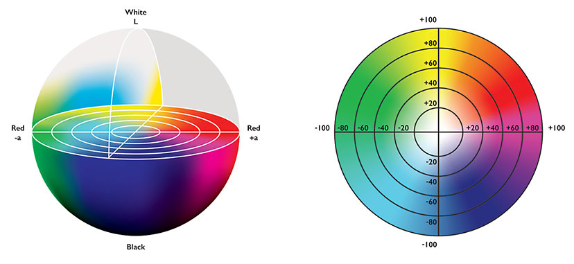
Relative Colorimetric
Finally, the Relative Colorimetric RI algorithm is used for colour proofing on off-white paper such as newsprint as it allows the user to determine the white point in the ICC profile. As such, this mode is not suitable for fine art printing.
Rendering Intent – Relative Colorimetric
It is important to understand how these Rendering Intents work in order to help you control the colour changes that occur when sending an image file for printing.
In general, the Rendering Intent (RI) algorithms either
- reinterprets the entire colour scene to avoid sudden colour transitions
- or subtracts the colours that are mismatched and prints without replacing the affected colours,
In summary, any photographer looking at producing fine art prints should understand their colour reproduction needs. If colour accuracy is important, it pays to invest in a printer with a very large colour gamut like the Canon imagePROGRAF PRO-500 and print in Absolute rendering mode. If colour accuracy is not the paramount concern, the Perceptual mode, when coupled with a competent photo printer, will produce visually satisfying results.
In the next article, we will look into the basics of setting up a colour-corrected workflow.
Receive the latest updates on photography news, tips and tricks by signing up with us!