How to Create Your Instagram Aesthetic and Get More Followers
Building a trademark aesthetic on your Instagram feed takes time.. and a whole lot of effort. But gaining more followers, especially for a branded account, can help spread awareness, strengthen branding and can even contribute to more sales. Whether you're an up-and-coming artist or established online store, read on below for our guide to championing a well-curated social media page.
Understanding Brand Persona

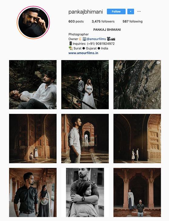
Credit: pankajbhimani
Unless randomness is your chosen aesthetic, aim to avoid posting contrasting images that do not adhere to a theme or look as though they would create a clash on your social media page. Take a step back to dissect the identity of your brand and figure out what you want your brand to portray. To start, here are some questions to help you out:
What feelings or mood do you want to evoke?
Collect images from any sources (Google, magazines, videography etc) that you gravitate towards. Then, create a mood board out of those images and pin down a few keywords that best describe the overall look. Break down different elements like colours, shapes, and texture before starting on your new Instagram aesthetics. Is it minimalistic with a neutral palette? Is there a consistent coloured tint across your mood board, or an identifiable theme to it?
Who is your target audience?
Understanding your target audience is crucial as your Instagram feed must appeal to them. If you’re a brand, you need to know your consumer’s buying habits and interests beforehand. If your consumers are parents interested in toddler fashion, a feed that features how-to style guides with a softer and brighter palette might work better than one with a black-and-white theme.
Having a niche

Credit: neverbeenwongbefore
Having a niche refers to what makes up the main bulk of your content. Will it be self-written poem screenshots, wildlife photography, inspiring quotes, or street photography? Also, do you have a specific schedule to post (once a day or certain hours to post etc.)? It is important to create consistency with your content and to stick with it.
If you’re really serious about it, you can even pre-plan a calendar before the month starts to gauge the amount of content for your feed and if the images adhere to your niche and look. You can also check out existing pages that target the same community as you and learn from their successes.
Check out this link for more inspiration!
Your brand colours

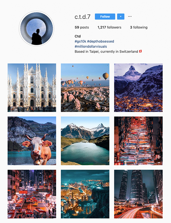
Credit: c.t.d.7
Identify your primary colours and secondary colours. Primary colours refer to the most prominent and repetitive family of colours used to populate your feed, while secondary colours are used to supplement whenever applicable. Finding out which tones and hues you want keeps your social media page clean, consistent and well-thought-out. It can also etch a bigger impression to first-time viewers on your page.
Be inspired by your niche and mood: go neutral if you’re planning for a minimalistic look or be inspired by the Pantone Colour of the Year 2020! Here are some questions to help you come to a decision on your colours:
What family of colours do you love?
Work off your mood board by extracting colours that are present in the collected images.
Does it fit your niche or your target audience?
For example, capturing wildlife while keeping a consistent pastel palette on your social media feed is pretty impossible - unless post-edits are utilised.
Bonus Tip: Use your DSLR’s exposure compensation or White Balance presets to add a blue or green overlay in your photographs.
Different Mediums, Unique Content

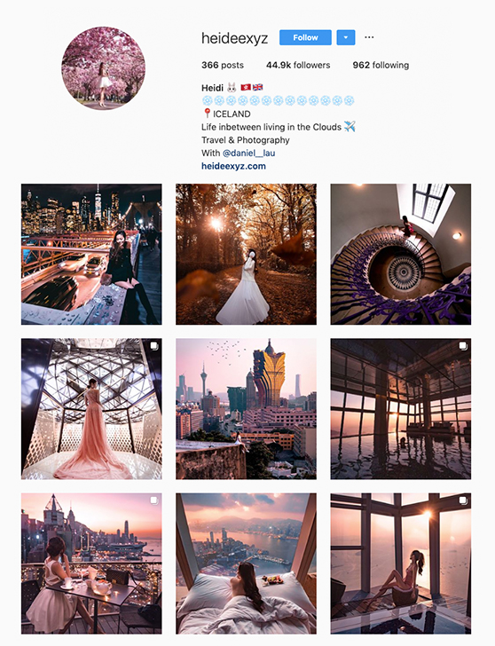
Credit: heideexyz
Instagram allows you to post in a few different formats: an image, a video, a GIF, time-lapse video, live cam, carousel post and text. Use all of them or prioritise a few (based on your niche) to give variation to your content. If you're not sure, ask your followers what they might like to see and work around that! Here's a question to ask to help you out:
Other than static images, what can you portray with your chosen subjects?
For example, an embroidery-focused Instagram feed can feature Instagram live or a time-lapse video/gif that showcases an interesting technique or the process of embroidery on the 1st of every month. A photographer’s Instagram account can also showcase a screen-recorded process of post-edits to break up the static images feed.
Tip: Use your DSLR’s Continuous Shooting mode to create different effects in GIF formats!
Social Media Challenges

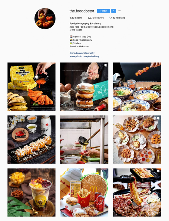
Credit: the.fooddoctor
Experiment with different layouts, colours and formats to determine what your viewers are attracted to the most. Work with typography, or jump into the latest trend/fad bandwagon to curate your content and be discovered by potential followers with the challenge’s hashtag. There’s #Inktober for Instagram artists, or try month-long challenges that come with themes or ideas so you can take a break from needing to curate new ideas. Here are some ideas to help you out:
- An Astrology sketch series for an art account?
- Vegan Month for a recipe-based Instagram account?
- #NauticalBlueNovember styling guide for fashionistas?
- Photo-A-Day challenge for photographers?
Read on further for more articles like food flatlay tips, tips to the perfect OOTD shots and how to acquire “the eye for photography” to take your Instagram aesthetics to the next level!
Receive the latest update on photography news, tips and tricks.
Be part of the SNAPSHOT Community.
Sign Up Now!


