


[Part 3] Enhancing the Impression of Nightscape Shots with the Colour of the Secondary Subject
You've put a great deal of thought into the positioning of the main and secondary subjects. How about making it even better by considering their colours? Using nightscape shots as examples, let us see how the colours of the main and secondary subjects can affect photographic works. (Reported by: Toshinobu Hori)

Pages: 1 2
Contrasting the colours of the main and secondary subjects
When you take a spontaneous shot from a location with a clear view, such as a riverbed, a large empty space is often created, and the resulting image would lack a well-defined theme. With such a scene, it is important to consider the colours of the main and secondary subjects in addition to their positioning.
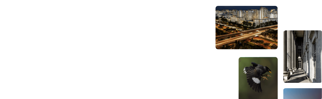
In Example 1, the red of the main subject (the bridge) is contrasted with the blue of the secondary subject (the cluster of buildings) to exude a lively, colourful atmosphere. In addition, the reflection of the colours on the water surface helps to add a dreamy ambience to the overall image. A perspective effect is created on the bridge to give depth to the image, and cropping away a part of the bridge boldly helps to stir the viewer's imagination as to what happens beyond. Finally, redundant space is reduced with the space above the buildings appropriately adjusted for a well-balanced composition.
[Example 1]
*Top view of the article

A: (Main subject) Bridge
B: (Secondary subject) Buildings on the opposite shore
EOS 5D Mark III/ EF24-70mm f/2.8L II USM/ FL: 70mm/ Manual exposure (f/8, 8 sec)/ ISO 200/ WB: 3450K
The shot was taken from a location where both the bridge over the river and the cluster of buildings on the opposite side were visible. The mirror-like reflection of the illuminated bridge and city lights on the opposite shore create a strong impression.
Managing colours to vary the impression given by the nightscape
Example 2 consists only of the main subject (the bridge). While capturing a full view of the bridge might be sufficient for drawing attention to its unique shape, the entire image is almost dominated by the red of the bridge, causing it to look monotonous and somewhat empty. Also, a complete view of the bridge is unable to stir the viewer's imagination on what lies beyond the image.
[Example 2]


A: (Main subject) Bridge
EOS 5D Mark III/ EF24-70mm f/2.8L II USM/ FL: 38mm/ Manual exposure (f/8, 8 sec)/ ISO 200/ WB: 3450K
Example 3, which captures the cluster of buildings on the opposite shore, is well balanced both vertically and horizontally. However, the entire image is dominated by blue as a large part of the bridge is cut off, and the result is a monotonous and empty impression similar to Example 2. Also, only the reflection is captured in the foreground, which makes the overall image appear flat with very little contrast.
[Example 3]


A: (Main subject) Bridge
B: (Secondary subject) Buildings on the opposite shore
EOS 5D Mark III/ EF24-70mm f/2.8L II USM/ FL: 59mm/ Manual exposure (f/8, 8 sec)/ ISO 200/ WB: 3450K
The colour contrast of the main and secondary subjects is a crucial factor in nightscape photography. If the location of the shoot is a waterfront and the city lights are reflected on the water surface, then the colours of the reflection also need to be taken into account. Therefore, when taking a shot, you will want to consider the relationship between the colours in the shot, i.e., if they are similar or contrasting.

Born in Osaka Prefecture in 1977, Hori, a company employee by day, is also commercial photographer who seeks to develop and increase awareness of nightscape photography through his activities. In recent years, he has also gotten involved in the television footage production as a footage creator. In 2014, he published a collection of photographs entitled Osaka Yakei [Night Views of Osaka] (SOGENSHA Inc.).

A monthly magazine that believes that enjoyment of photography will increase the more one learns about camera functions. It delivers news on the latest cameras and features and regularly introduces various photography techniques.
Published by Impress Corporation