The compact body of the mirrorless EOS M series is packed with the high performance that an EOS camera can offer. The latest model, the EOS M3, has undergone significant evolution particularly in the AF and controls. In the following, we will reveal the enthusiasm that the developers showed toward this model. (Edited by: Camera Biyori, Photos by: Toru Matsushima)


Planner: Takenari Kawano

Designer: Hironori Oishi

Engineer: Jiro Yamamoto

Engineer: Shinobu Watanabe

Engineer: Takaaki Fukui

Engineer: Hiroyuki Ogino
A new shape for enhanced grip
- We at the "Camera Biyori" editorial committee are also using the EOS M. It looks like the EOS M3 is packed with new features and very easy to handle.
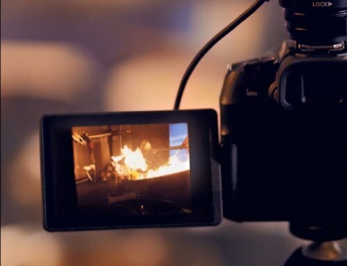
Kawano Thank you very much. Our mirrorless EOS M models are designed with the concept of allowing users to enjoy the "speed", "comfort" and "quality" of the EOS SLR camera series more easily. On the EOS M3, we have added features that users are seeking, such as a tilt-type LCD monitor convenient for taking selfies, a built-in flash, and an external Electronic Viewfinder (EVF). As for the controls, the dials were separated to make the camera more user-friendly. We also introduced a new function named "Creative Assist" for those who do not know much about photography but want to take better photos. With "Creative Assist", beginners will naturally be able to improve their photographic skills.
- It looks very different from the previous models. It has a more sophisticated feel.
Oishi The EOS M3 is equipped with many features, and it also inherited "smartness", the identity of the series. We thought of combining two factors, that is, the ease of carrying the camera around anywhere and a professional level of performance that allows users to fully enjoy their photographic experience.

The compact body of the EOS M3 is packed with high performance, excellent functionality, and advanced design for an SLR camera.
- What was the point that you were most particular about?
Oishi The area around the shutter button is shaped in a way that allows your right hand index finger to rest naturally on it.
- The grip is unlike those on the previous models. It is easier to hold.
Oishi Female users are one of the main target groups for mirrorless SLR cameras, so we took their voices into consideration too. The texture of the leather used for the grip is newly developed, and we looked for the best in terms of the appearance and texture through adjustments in micron units. In the past, the body of the EOS M models was characterized by a smooth texture. For the EOS M3, we gave it a rougher finish for a richer expression of the design.

Some design drawings of the EOS M3. From these drawings, we can tell that there were several patterns for the dial layout. There was also a proposal to make the colour of the grip brown besides the black and grey versions.

The EOS M3 is equipped with a dial for exposure compensation. It does not protrude too much from the body, and is located at a position that makes turning easy. Attention is also paid to its size, feel of the click, and the mechanical sound when the dial is turned.

The photo shows the evolution in design for the area around the shutter button. The ease of pressing the button took top priority, and they tried out different angles and shapes for the diagonally-cut surface. An electronic dial is placed around the shutter button for enhanced operability.
Thorough devotion to detail
- The white colour helps to add a gorgeous touch.
Oishi What we aimed for was to create a deep and sophisticated white by adding a pearl layer over the white paint. At the same time, we selected greyish beige for the grip because we did not want it to look too feminine. Most of the external parts were produced separately for the white and black bodies.
Yamamoto That required a lot of work on our part. We even made a new silver pancake lens, and slightly different colours were used for the metal fitting of the strap. Although personally, I thought it would be sufficient to use the same colours (laugh).

Painted samples for the black body. A rougher texture, used on SLR models, has been adopted to exude a sophisticated and professional feel.

For the white body, silver-coloured lenses have been newly designed. Many different designs were considered not only for the lens tube, but also for the silver hues of the lens mount.

Different colours have been adopted for the strap fitting of the black and white bodies. Silver is used for the white body, while that for the black body comes in a dark tone. Parts, including dials and buttons, are also produced separately according to the colour of the body.
- So the number of colours has been narrowed down to two.
Yamamoto With this kind of meticulous work, it would have been a big problem if we had four or five colours (laugh).
Oishi We have selected the colours that best match our concept of a "high-quality model".
- Which colour do you prefer?
Oishi I'd prefer white because of the effort that it had cost me during development. We started with selecting the colour of the resin material.
Yamamoto The material selection work was a painstaking process because simply using a white colour for the resin would reduce the light-blocking effect, causing ambient light to enter the image sensor. Another large problem was how to make the gap between the parts less obvious as different thickness of the coating layer was needed for the white and black colours in order to obtain the right hue.
- With more dials, the EOS M3 is much easier to operate.
Yamamoto Our original idea was to have only the front dial for changing the aperture value, and no exposure compensation dial. As our discussion progressed, we decided that it would be better to enable manual adjustment, as well as to include the exposure compensation dial. Our next step was to explore the best layout for operating the exposure compensation dial, front dial, and mode dial. We also needed a simple design because we did not want to make it look too complicated to operate. It would not have been so difficult to make the dials easy to turn if they were larger, but the request from the designer was to make them as flat as possible. As a flat dial needs to be operated with the ball of the finger, we paid much attention to determine the tightness of the dials when they are turned.
Characteristics of the EOS M3

- Large APS-C format sensor
- Grip for a firm hold
- Easy-to-understand menu descriptions
- Built-in flash
- Dials and buttons that allow for intuitive operation
- Highly responsive LCD touch screen that can be flipped 180°
The mirrorless EOS M models add a touch of "swiftness" to the "speed", "comfort", and "quality" of the EOS series. Equipped with features such as an image sensor with a resolution of about 24.2 megapixels, dials and other controls, a tilt-type LCD monitor, and a built-in flash, the latest EOS M3 offers significantly enhanced performance and operability. Maintaining a user-friendly touch screen and menus, the EOS M3 allows you to enjoy the photographic experience to the fullest. This is a model recommended both for experienced users and beginners.
Image sensor/ 22.3×14.9mm CMOS
Effective pixels/ approx. 24.2 megapixels
Dimensions (W×H×D)/ approx. 110.9 × 68.0 × 44.4mm
Weight (including battery and memory card)/ approx. 366g
LCD monitor/ Wide 3.0" TFT colour LCD monitor (tilt type)

Camera Biyori is a Japanese photography magazine introducing charming photos and daily joy with cameras. Suggesting fun activities relating to cameras and photography, Camera Biyori editorial department also offer the "Camera Biyori Photography School" to recommend its readers to engage in photography and have fun.
Published by Daiichi Progress Inc.


