


Introduction to Fine Art Printing – Part 9: Defining Your Colouring and Toning Style
Producing a fine art print has always been a labour of love. The pioneers of film photography would spend long hours in the dark room, developing negatives and fine-tuning a print. Digital photographers too, spend a good amount of time hunched over their computers to finesse their image in the ‘digital darkroom’. By enhancing the colour or tonality of the image, the digital photographer gains an invaluable opportunity to imbue the photographer’s identity and creative vision into each print.

Defining your own photo colour palette
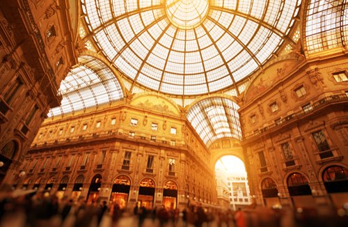
As a fine art photographer, the choice of colour palette employed contributes to your style. Good examples of cool tones being expertly used can be seen from the HBO series, The Game of Thrones or the Hollywood period piece, The Revenant. The cold hues help contribute to the sense of mystery as the story unfolds. On the other hand, blockbusters such as Mad Max or The Martian, make the use of foreboding red tones to enhance power and destructiveness of the desert realms. To achieve your own unique colour palette requires basic knowledge of the following tools in Adobe Camera Raw plugin for Photoshop. Once mastered, you can apply your style across almost any image editing software.

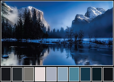
Cool colour palette
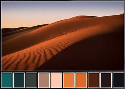
Warm colour palette
White balance
In essence, white balance correction is the process of colour adjustment to make white or grey areas appear visually correct in the final image. However, to the creative photographer, it is also a tool to affect the mood of the final image.
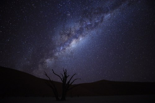
Adjusting white balance can transform landscapes

Here are three different ways to set your white balance in Adobe Camera Raw (ACR): the Temperature and Tint sliders, the White Balance presets drop-down menu, and the White Balance tool. By sliding the Temperature and Tint slider for example, it is easy to transform a cold, autumnal landscape, into one that is glowing with late evening light. One can also enhance the intensity of a sunset by increasing the colour temperature of the scene, instead of trying to gain a neutral white point in the image.
Split-toning

Split-toning is simply the addition of two different colours to the highlights and shadows of a photograph. This technique can be applied to both colour and black-and-white images. Photographers often use split-toning techniques in black-and-white portraits, to add an additional layer of tonality to the final print. Split-toning can bring more warmth in the shadow areas or cool the highlights to mimic a metallic effect, such as copper tones. Sepia toning is a popular split-toning effect that mimics the look of vintage photographs.
Split-toning effects

For colour prints, split-toning helps create a unique colour scheme in the final print. For example, to ‘tone’ the shadows with a green copper effect, simply click on the split-toning tab, choose shadows and move the slider to select the desired colour range. The chosen effect is rendered onscreen, making it easy to experiment with different colours. By consistently applying the split-toning effect on your portfolio of images, you can establish an identity and style of your own.
HSL grayscale
This is a powerful colour enhancement tool for adjusting the hue (colour), saturation (richness), and luminance (brightness) of an image independently. For example, by selecting the saturation tab, you have the power to create warmer sunsets or enhancing the red hues of a flower, simply by sliding the corresponding colour sliders as shown below. Changes to hue and luminance tabs can be done in the same way.
Before and after adjustment for hue, saturation, and luminance

Before and after converting to grayscale

Adjusting the HSL of an image

Tone curve
The Tone Curve tool gives you fine control over how the highlights, midtones and shadows appear in your print. By pulling the tone curve upwards as shown, exposure of the entire photo will be brightened. Conversely, pulling the tone curve down has the effect of darkening the entire image. It is also possible to impose a ‘fade’ effect on the entire image, simply by moving the end of the shadow point upwards.
The tone curve is useful for creating high contrast black-and-white imagery too. This can be easily achieved by applying an S-shaped tone curve to a black-and-white image. Careful manipulation of the tone curve is an essential step in making a mesmerising fine art print.
Creating a fade effect

Creating black-and-white imagery

In summary
By mastering the White Balance, Split-toning, HSL Grayscale and Tone curve tools, the photographer has the power to affect the colour and tonality of their images, allowing their creation to ‘sing’ a unique tune in print.
In our next article, we learn how to remedy imperfections in the image caused by the lens or camera sensor.
Receive the latest update on photography news, tips and tricks.
Be part of the SNAPSHOT Community.
Sign Up Now!