


Understanding Colour Theories: A Photographer-Friendly Guide

Invented by Sir Isaac Newton, the colour wheel and theories have been used in all aspects of life, like clothing, design and photography, to amplify visual appeal and aesthetic. Prepare yourself for a kaleidoscopic journey as we explain the 5 most-common colour harmonies of the complementary, analogous, triadic, split complementary and tetradic combinations, with photograph submissions by our Canon community!
Complementary Colours

Credit: Jushen Lee
EOS-1D X Mark II, EF16-35mm f/2.8L II USM, f/6.3, ISO 125, 1/400s, 30mm
One of the most-utilised colour harmonies is the complementary combination. Within the colour spectrum, complementary colours are determined by the colours that are opposites of each other. For example, green and red, purple and yellow, and as pictured above, blue (sky and sea) and orange (human subject). The combination brings out contrast from both warm and cool tones and is often used to highlight a focal point or add appeal/tension to the image. Due to the need for only two colours, this combination is easiest to work with to produce a dynamic shot.
Analogous Colours
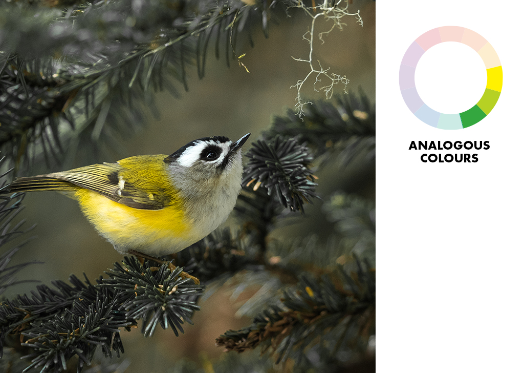
Credit: Vincent
EOS-1D X Mark II, EF600mm f4L IS II + 1.4 x III, f/5.6, ISO 1600, 1/400s, 840mm
Unlike other colour harmonies, analogous colours are the most subtle in contrast. However, the output that adopts this colour combination is considered to possess a strong sense of serenity. This is due to the seamless transition of three adjacent colours within the colour wheel as recognised by the human eye. The example above showcases the use of yellow (bird), yellow-green (background) and green (leaves). Analogous colours are not the easiest to come by and will often need a little post-production tweaking to achieve the effect.
Triadic Colours

Credit: Naveen
EOS 600D, EF-S18-55mm f/3.5-5.6 IS II, f/7.1, ISO 100, 1/160s, 55mm
A triadic colour combination uses every 4th colour in the colour wheel. As a gauge, it should create an equilateral triangle when the colours are marked out with a connecting line. This will also result in a colour-ratio imbalance of 2:1, and as shown in the example above, there are 2 warm colours of yellow-orange (flowers) and red-purple (branches) against a single cool tone of blue (background sky). Much like the Rule of Thirds, the triadic colour combination delivers visual appeal and a sense of structure through the surprising quality of imbalance. To use a triadic colour combination is to highlight one dominant colour while the other two play a supplementary role.
Split Complementary Colours
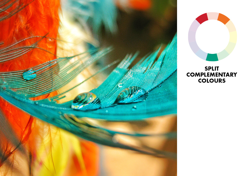
Credit: Harshima
Digital IXUS 185, f/2.8, ISO 100, 1/400s, 62mm
Split complementary colours, or compound harmony, uses two alternating colours plus an additional colour that’s opposite to the skipped colour (refer to the diagram above). Though the 2:1 colour-ratio imbalance is the same with the triadic combination, the difference with split complementary lies in the use of a colour range that is closer, and seemingly more harmonious between warmer and cooler tones. The slight change results in a stronger visual contrast when compared to the triadic combination but with less tension than the complementary combination. For the example above, the colours used are red, orange-yellow and teal.
Tetradic Colours

Credit: Michal Kokot
EOS 50D, f/4.0, ISO 400, 1/600s, 100mm
The tetradic colour combination uses four colours and consists of two complementary combinations that form a rectangle when drawn out with a connecting line. The shorter ends of the rectangle are always one colour spaced apart. Though complementary colours are all about tension (and we would expect to have even more when utilising two sets), the tetradic colour combination still works. The strong contrast is often diffused by the variety of colours present in the scene which results in a non-competitive, harmonious flow without having one specific colour vying for dominance. Even in differing colour distribution like the image above, the dominant cooler tones of blue (sky) and green (plants) with subtle warm tones of yellow (ground) and orange (boat’s door), the result will still be pretty balanced and pleasing to the eye.
Understanding the colour theories is merely one of many areas a photographer must learn throughout his or her journey. You can find a colour scheme that works for you as a guideline or use it as an advantage to wow your viewer, but you should never neglect your creativity and limit yourself to your chosen colour palette. Explore, experiment and break rules!
Here are some other articles you can read about regarding the use of colours in photography:
Abstract Photography: Using Colour