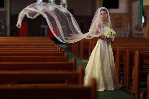
Simple but Essential Compositions (Part 1): Rule of Thirds & Rule of Quarters
Photos taken by skilled photographers give viewers a sense of stability and not one of unease. The reason for that is to do with composition. Here, with the help of several photo examples, I will explain the basic compositions that you should ideally first master when starting out in photography. (Reported by studio9)

The 4 compositions that you should first master
Have you ever felt that compared to other photos of the exact same scene, the photos that are captured by skilled photographers give you a sense of stability and not one of unease? This is often to do with the composition.
Composition is about deciding how the main subject, background, and so on, are arranged in a photo. As long as the picture is properly composed, even if other elements (colour, brightness, etc.) are less than perfect, the photo will appear to have a high degree of completeness!
People with an artistic sense are able to take clean photos that give you a sense of stability without having to be particularly aware of composition. However, the average person cannot get away with that so easily. That’s why the first step to improving your photos is to master the basic types of compositions.
There’s not a lot you need to know; all you need to do is master these 4 compositions:
- Rule of Thirds (Rule of Thirds Composition)
- Rule of Quarters (Rule of Quarters Composition)
- Centre Composition
- Diagonal Composition
Each type of composition is simple, so you’ll surely remember them after seeing them just once. Let's look at each composition type in detail, together with some actual photos.
In Part 1, I will explain the following:
- Rule of Thirds (Rule of Thirds Composition)
- Rule of Quarters (Rule of Quarters Composition)
One Rule of Thirds to rule them all!
I will first explain the Rule of Thirds (Rule of Thirds Composition), a proven method. Above all else, keeping this versatile composition in mind will ensure that your photos appear to have a high level of completeness about 95% of the time! This is the first composition you should master when you start shooting.
In this composition, the screen is divided into thirds, horizontally and vertically, to form nine parts, and the subject is arranged accordingly.

By skilfully arranging the subject along the orange lines or at their points of intersection, you can create a composition that somehow makes people feel good and imparts a sense of stability when they see it.
It’s that easy! Let's see the lines on an actual photo:

This might be a very simple photo, but placing the pigeon on the intersection at the bottom right somehow creates a sense of stability in the picture. If the pigeon was in the centre, it would look like the following photo:

The photo looks rather amateur-ish, doesn't it?
There is roughly the same amount of space to the left, right, top and bottom of the pigeon, which creates a sense of of instability. Incidentally, this kind of composition with the subject placed in the centre of the photo is called Centre Composition. I will explain it in detail in Part 2.
Let's look at some other photos that make use of the Rule of Thirds.

The Rule of Thirds is effective even for portrait photos. You can see that the petals of the red spider lily are placed at the top-right point of intersection. Incidentally, you don’t have to dive the picture into exact thirds. The Rule of Thirds is just a guide. Even in the above photo, strictly speaking, the subject is off-centre from the point of intersection.

Now let's look at a photo with a few more elements. The cherry blossoms have been arranged such that they form a boundary around the gridlines. Also, the castle in the background is positioned near the bottom-left point of intersection.
The next photo is of an aquarium.

You can see a large orca in the top left, and a child attempting to reach for it in the bottom right of the photo. By placing two or more subjects on the points of intersection in this manner, you can achieve well-balanced photos.
In the same way, try visualizing gridlines dividing the image into thirds when you look through the viewfinder, and arrange the subjects using the points of intersection and lines as markers. By doing that, your photos will provide a sense of stability and have a moderate sense of space, in addition to appearing well taken.
However, because this is such a proven method, the downside is that it can be seen as playing it too safe and creates dull photos. At such times, how about trying the Rule of Quarters, which I will introduce next.
Try the Rule of Quarters once you get used to the Rule of Thirds
The Rule of Quarters Composition, which I will introduce, divides the screen into 16 parts, using 4 horizontal and 4 vertical lines.

Compared to the Rule of Thirds, subjects are arranged closer to the outer edges of photos when using the Rule of Quarters, which creates space around the arranged subjects, expanding the width of the photo. A DSLR in particular has an aspect ratio of 3:2, being wider horizontally, so it is especially suited for this.
When I looked back at my own photos, I found that I took more photos using the Rule of Quarters than the Rule of Thirds.

Here is a photo of a sunrise. By placing the horizon in the lower 1/4 of the screen, I could insert a broad expanse of sky, capturing its subtle shifts and changes. Moreover, by placing the morning sun in the bottom-right of the image, I could fully capture the changes in the colour of the sky looking from the bottom right of the photo to the top left.
Especially in the case of photographs that capture a wide expanse, such as scenery, the subjects tend to be gathered in the centre when using the Rule of Thirds, making the photos feel crowded. At such times, I recommend using the Rule of Quarters.

In this photo the horizon is placed in the centre, giving the impression that the sea is very calm. Also, there are 2 people appearing in the photo around one of the points of intersection, showing how small humans are in contrast to the big sea. Although the Rule of Thirds was not used here, the photo doesn't look strange at all.

This is a slightly unusual scene. The large space on the left and in the background has been captured using the Rules of Quarters, while the plant in the foreground is the main subject, making it seem as if the photo is telling a story.

In this photo too, you can see that the primary subject was placed in the bottom left, while on the right side, through to the background, there is a well-expressed smooth bokeh effect.
By using the Rule of Quarters, as in the photo above, you can create photos that are slightly different from those using Rule of Thirds Composition. Once you are used to using the Rule of Thirds, why not challenge yourself with the Rule of Quarters?
I hope you have gained an understanding of the Rule of Thirds and the Rule of Quarters. In the next part, I will explain more compositions that you should master when starting out in photography: Centre Composition and Diagonal Composition. I hope you’re as excited about it as I am!

A photography website established in Japan in 2011. With the slogan “Bringing photography closer to you”, the site provides content that is useful for everyone who enjoys photography. Besides web content, studio9 also conducts seminars and workshops.


