


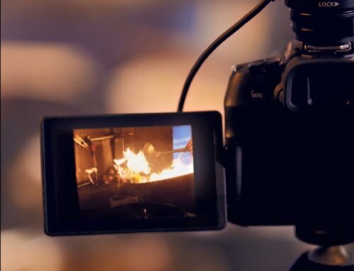


Introduction to Fine Art Printing – Part 8: Testing the Paper
In the previous article, we discussed how the choice of paper has a crucial impact on the quality of your prints. Different papers have unique ink absorption characteristics, producing markedly different results on the same printer. As a photographer producing fine art prints, it is vitally important that you identify a paper that faithfully reproduces the intended artistic vision. In this article, we look at how to ascertain the suitability of any fine art paper through a customised colour test chart.

Choosing a test chart
While a wide range of ready-to-use colour charts are available, we recommend creating your own chart in Adobe Photoshop. This requires more work but it will ensure that your prints are consistent with your vision. Your custom chart should contain 3 things:
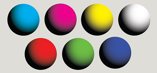
1. A group of 7 spheres rendered with a continuous gradient from 0 to 100% ink coverage.
2. These spheres should represent each primary colour from RGB and CMYK colour space.
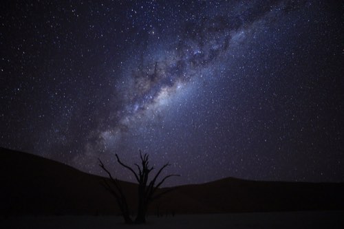
3. An image that is representative of your photography style e.g. portraiture, landscape.
We recommend using colour-graduated spheres, instead of square blocks, as these would highlight any break in colour transition (indicating an unwanted tone jump), making it easier to spot paper deficiencies. For example, the image of an azure sky or a red rose in bloom would express a whole range of hues and tones, so these graduated spheres offer a good simulation of actual print conditions. The third point, about embedding a representative image style, serves as a ‘control’ that would allow the photographer to easily spot minor shifts in colour or detail.
When printing the test chart, remember to select ‘perceptual’ rendering intent (please refer to Part 3 of this series for more detail). Use a fine art paper that has been recommended for use with your printer.
Checking the printed test chart against monitor
Assuming you have colour-corrected your monitor and printer (refer to Part 5 and Part 6 in this series), the test print produced should be a good representative of your onscreen viewing experience. However, you might encounter print artifacts in the gradation areas, e.g. halo effect on the sphere, circular banding, etc. These occur due to tone jumps and are easily rectified by adjusting the tone curve. Once the chart is printing well, you are ready to start.
Test on Canon Photo Paper Pro Platinum, PT-101
- Excellent colour balance
- Sharp and high-definition rendition

Print performance evaluation
This paper features a high degree of brightness for excellent contrast. You can enjoy a gloss-like print finish when printing with the pigment inks used in the Canon imagePROGRAF PRO-500. However, with dye-based printers such as the Canon PIXMA PRO-100, some bronzing can be seen on the greyscale sphere (see below). As such, this paper is best used for printing colour photos on the PIXMA PRO-100.
Test on Canon Photo Paper Pro Luster, LU-101
- Good colour balance in both warm and cold light
- Anti-reflective surface

Print performance evaluation
Canon Photo Paper Pro Premium Matte is a versatile photo paper with excellent colour balance. The slight unevenness of the paper surface resembles a sandblasted finish, and helps create a solid black tone. The anti-reflective finish flatters the printed image under most ambient lighting situations – even those with ultraviolet content, e.g. fluorescent lamps.
On pigment ink-based printers like the Canon PIXMA PRO-10, the colour rendition for the primary colours was bright and vibrant, making it well suited for colour prints. On dye-based printers such as the Canon PIXMA PRO-100, the inks are absorbed into the paper fibre which helps create dense black printing. The slight bleeding of the ink also means that the gradients of primary colour spheres are not as defined as those produced by PIXMA PRO-10. However, this printing style may suit photographers looking for a slightly abstract look when printing in colour and black-and-white.
Test on Canon Photo Paper Pro Premium Matte, PM-101
Smooth textured matte paper designed exclusively for use with PIXMA PRO printers
- Equally suited for pigment and dye-based PIXMA PRO printers
- Smooth rendition
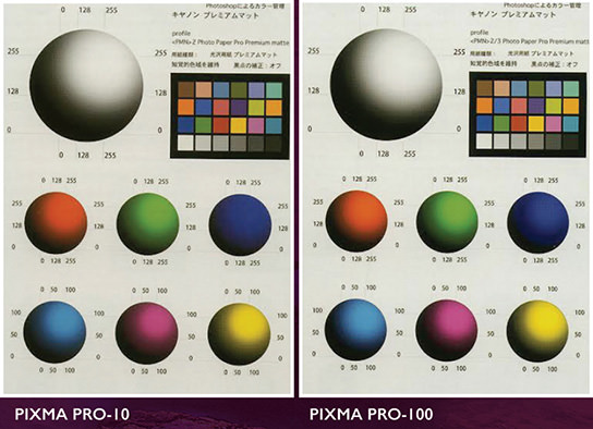
Print performance evaluation
This paper makes use of fluorescent brighteners (OBA) so the paper is bright and white, and is suitable for printing images with vivid colours. The paper works well for both dye and pigment inks, and is perfect for non-archival use, e.g. at exhibition or for display purposes. Printed on the PIXMA PRO-10, the colours look accurate, with beautiful grey scale rendition. On the PIXMA PRO-100, the primary colours and greyscale shows a slight tone jump but the printed result is still beautiful. Again, the use of this paper rests on strength of its colour rendition and is perfect for High Dynamic Range landscape printing or fashion applications.
On non-traditional media
Colour chart testing is particularly useful if you are experimenting on non-traditional media such as uncoated Japanese art paper. It gives you an overview of what to expect in colour rendition, without wasting time and ink on generating a whole print.
Colour chart testing is also useful as a benchmark when using third-party fine art paper. It is an objective way to assess colour performance against known paper types. Armed with your customised colour chart, your road to achieving a signature look on paper is that much easier.
In the next article, we will look into digital editing techniques.
Receive the latest update on photography news, tips and tricks.
Be part of the SNAPSHOT Community.
Sign Up Now!