Professional Composition Techniques (1): Visual Guidance, Unexpectedness, and Subtraction
In the basic composition techniques such as the Rule of Thirds and Centre Composition, you learned how to divide the frame and where to place the subject. Advanced composition techniques are a little more complex—you now have to think about the subject’s relation with other elements in the shot as well as the visual effect from the viewer’s perspective. But mastering thing them will increase the impact of your shots.
Here are three concepts to start off with: Visual Guidance, Unexpectedness, and Subtraction. (Reported by: Tatsuya Tanaka)

1. Visual guidance: Lines can direct a viewer’s attention!

Visual Guidance is a technique that uses lines in the image frame to guide the viewer’s eyes towards a main subject. These lines usually take the form of elements such as roads, rivers or railway tracks, and can go from the front to the back of the image, from the left to the right, etc. As they are so obvious, it is very easy for the viewer to see the photographer’s intent.
Because of the way it guides the viewer’s vision, Visual Guidance can help establish relationships between elements in an image.
If the line moves from the front to the back, Visual Guidance can also help to create a sense of depth in the image.
Using railway tracks to guide viewers’ attention to the tunnel


In both images, the railway tracks guide the viewer’s attention to the tunnel. But one image has more impact than the other.
What’s wrong with the failed shot?
The tunnel is located at a slightly lower position from the top. Even though the viewer’s attention follows the line created by the railway track, it gets distracted by the many elements above the tunnel, especially the autumn foliage on the hill above the tunnel.
What the successful shot gets correct
The tunnel is positioned at the top. This makes railway tracks seem to extend longer and take up more of the image, making it a more effective visual guide to the tunnel.
A farm road guides viewers’ attention to the house


In the successful image, I wanted the viewer’s attention to fall on the thatched-roof house that stands beyond the rice field in the left side of the image.
What’s wrong with the failed shot?
The composition in the image marked “X” juxtaposes and draws equal attention to both the houses. You can see a path in front, but it blends in with all the other horizontal lines in the image and is not obvious enough to have much effect.
What the successful shot gets correct
The farm road is captured in the foreground, and automatically commands the viewer’s attention. The viewer’s line of sight follows the road past the rice field to the thatched house on the left, exactly where I wanted it to eventually end up.
Unexpectedness: Finding an angle that differs from the norm

If you feel that your images always look the same, it could be because you are shooting from the same angles again and again. Your viewers will get bored too. To break out of that, you need to see the subject differently, and making some changes to how you see the shot through the lens can help.
Here’s what you can do to get a different perspective
- Change your focal length. For example, if you like to shoot wide-angle, challenge yourself to shoot telephoto, and vice versa. This will immediately force you to change your composition.
- Move your camera to a higher or lower position, especially if you are using a tripod. Be bold, try at least 10cm higher or lower. You get a new perspective of things.
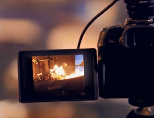
- Try changing the camera angle. For example, instead of shooting head on, see if you can get a good shot from the side. Tilt your camera, or try a low-angle or high-angle shot. If you have a Vari-angle LCD screen, make the best of it! (Click here to find out more about position and angle)
- Move closer to your subject. Even a few centimetres could change your composition dynamics.
A different angle could make a shot more impactful

The shot you would normally take
This is a telephoto head-on shot of a gorilla resting. It conveys a relaxed atmosphere. The photo documents the ambience and environment, but why stop at that?

The portrait of a wise man
This shot looks dramatically different from the previous one, doesn’t it? I simply changed the shooting position and focal length. I then observed the gorilla, and captured the instant when it put its finger to its mouth. The result: The gorilla looks like an old, wise man, deep in thought.

Sharing an intimate moment
In this shot, I positioned two chimpanzees on the left and right to make them look like a couple sharing an intimate moment. I tried to imagine how a third-party observer would feel looking at this image when I composed it. If you frame your images well, they can tell a story.
Subtraction: Removing distracting elements to make a subject stand out

Whenever a shot is taken hastily, or when you fail to check the composition through the viewfinder, unwanted objects are often captured in the resulting photo. This is particularly so at the edges of the image, and tends to happen especially when your camera has less than 100% viewfinder coverage.
To “subtract” such distracting elements, you will want to recompose the shot. An easy way is to use a longer focal length, which can crop these elements out and simplify your image. (Find out how in: Improve Your Travel Photos with the EOS M10 #3: Using a Telephoto Zoom Lens)
“Subtraction” can make subjects stand out better


The failed shot contains many elements; we’re not sure what to focus our attention on. Using a longer focal length removed unwanted elements. This results in a simpler composition, where our attention is drawn to the trees, the intended main interest.
Making the photographic intention clear


In the failed shot, the composition is “greedy” as it attempts to capture everything that is in view from the shooting position. However, doing so results in an ambiguous shot where the photographer’s intent is not clear. In contrast, the successful shot omits the clutter in the background and gives the main subject more space in the frame, making the photographic intent more obvious.
For other articles in the Professional Composition Techniques series, check out:
2. “Pattern & Rhythm” & “S-Curve”
3. Making Good Use of Lenses
4. Making Good Use of Special Lenses
To go back to the basics, read:
Composition Basics: Framing, Horizontality and Verticality
Receive the latest update on photography news, tips and tricks.
Be part of the SNAPSHOT Community.
Sign Up Now!About the Author
A monthly magazine that believes that enjoyment of photography will increase the more one learns about camera functions. It delivers news on the latest cameras and features and regularly introduces various photography techniques.
Published by Impress Corporation
Born in 1956, Tanaka is one of the rare photographers who produce works across a wide variety of genres from an original perspective. These genres range from objects in our daily lives, such as insects and flowers, to landscapes, skyscapes, and celestial bodies. Besides photography, Tanaka has also developed his own approach in post processes including retouch and printing.


