Composition Basics (3): Centre Composition, Symmetrical Composition
In Part 3 of this series on composition basics, we learn about the centre and symmetrical composition techniques. These widely-used techniques may be simple, but use them well and they can be powerful tools for visual expression. (Reported by: Tatsuya Tanaka)

Centre composition: The most powerful way to draw attention to your main subject

As the name suggests, in the centre composition, the main subject is placed smack in the middle of the image frame. Most beginner photographers will compose their shots this way by default, especially if they haven’t learnt to shoot with intent, or if they want to place their focus on something in the centre of the frame.
For that reason, some schools of thought consider it a bad composition technique. But it doesn’t have to be the case! The following benefits make it a powerful tool.
Benefits of the centre composition
- The photographer’s intent is clear. Things placed in the centre of a frame tend to have stronger visual weight. When the main subject (centre of interest) is right in the centre, it is very clear what the photographer wants the audience to pay attention to.
- Stability. It is a very stable composition because there’s nothing to distract the eyes.
Examples of centre composition
Centre composition is good choice for capturing close-ups of plants and animals, as you can see from the following examples.
1. A powerful way to guide the viewer’s attention


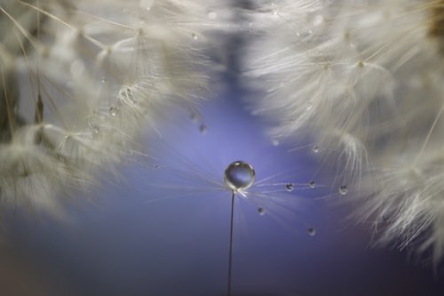
In this shot of a flower, the area in focus is smack in the middle of the frame, in contrast with the creamy bokeh effect that surrounds it. The balance between the two work together to convey the softness of the flower: If not for the sharp area, the image would have simply looked out-of-focus.
2. Ideal for emphasising the main subject


This centre composition is enhanced by the creamy background bokeh, which simplifies the background. A centre composition could easily look amateurish if there is too much clutter that prevents the main subject from standing out. Always be aware of the elements surrounding your subject, and make the background as simple as possible.
3. The subject doesn’t have to be small


I managed to fit the entire monkey into the centre of the frame. Even if an object seems too big, sometimes, all you need is to adjust your focal length and/or shooting distance.
Tip: Watch your proportions!
If your subject occupies too little or too much of the image frame, the shot will not look visually balanced. Make sure that the main subject is not overpowered by other elements. Experiment with different focal lengths/shooting distances until the proportions look just right.
For more tips on using centre composition, also see:
Simple But Essential Compositions (Part 2): Centre Composition & Diagonal Composition
Symmetrical composition: Express the beauty of harmony

In a symmetrical composition, the two halves of the image are mirror images of each other. Such a composition automatically creates a sense of harmony and aesthetic balance—an easy way to achieve a beautiful shot!
Types of symmetry
Ideal subjects for symmetry are everywhere. While there are many types of symmetry. Here are two of the most common that you will see.
1. Horizontal symmetry


This shot of a building uses a horizontally-symmetrical composition: The left and right halves of an image are symmetrical to each other. This is the form of symmetry that you usually see in architectural structures.
You may be interested in:
Architectural Photography #1: 3 Basic Concepts
2. Vertical symmetry


In a vertically-symmetrical composition, a subject and its reflection occupy the top and bottom halves of the image respectively. This is the kind of symmetry that you can find in water reflections.
Tip: Shoot in calm weather conditions
For the clearest water surface reflections, shoot in calm weather conditions. The above shot was taken early on a windless morning.
More tips on photographing water reflections here:
Create a Cool, Serene World with Water Reflections and White Balance
Tips for Water Reflection Photography: Fun with Puddles!
Reflections make a symmetrical composition more charming

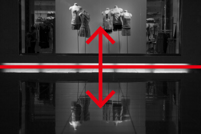
Keep an eye out for reflective surfaces, as these can also help you to create interesting symmetrical compositions! It doesn’t necessarily have to be a mirror or a water surface: The shot above was possible thanks to a beautifully-waxed floor. For low-angle shots like this, it also helps to have a Vari-angle LCD screen.
Tip: Find ways to add variation
One issue with symmetrical compositions is that they can look rather boring: Either the top and bottom halves share a similar pattern, or the left and right halves do.
To make the shot look more interesting, try to add some variation to it. For example, you could try different ways to guide the viewers’ eyes, or look for rhythm and patterns in the subject. See how many ways you can combine symmetrical composition with other composition techniques!
Other articles in this series:
Composition Basics: Framing, Horizontality and Verticality
Composition Basics (2): Main and Secondary Subjects; Triangles
Composition Basics (4): Diagonal Composition and the Rule of Thirds
Receive the latest update on photography news, tips and tricks.
Be part of the SNAPSHOT Community.
Sign Up Now!About the Author
A monthly magazine that believes that enjoyment of photography will increase the more one learns about camera functions. It delivers news on the latest cameras and features and regularly introduces various photography techniques.
Published by Impress Corporation
Born in 1956, Tanaka is one of the rare photographers who produce works across a wide variety of genres from an original perspective. These genres range from objects in our daily lives, such as insects and flowers, to landscapes, skyscapes, and celestial bodies. Besides photography, Tanaka has also developed his own approach in post processes including retouch and printing.


